

Configuring Your Assistant
Overview
This section covers parameters that can be changed to tweak your shopping assistant. This can range anywhere from color, to placement, to adding new features, and more. By adjusting the settings of your shopping assistant, you can personalize your customer's experience to better suit the needs of your brand.
General Settings
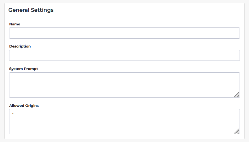
Name
The name of your shopping assistant. This will appear on the dashboard to identify your assistant.
Description
Your shopping assistant's description. This appears on your internal Assistant dashboard to provide context about your assistant.
System Prompt
This is a set of instructions that defines the assistant’s behavior and constraints. This field controls tone and role, the data sources the assistant is allowed to use, and rules for how it should answer questions.
Example: You are a helpful assistant for tenant-demo web store. Answer user questions using the data available found within the HawkSearch search tool. Don't use your own knowledge. If you need to filter data, use facets and run the search again.
Allowed Origins
This field defines which websites or domains are permitted to interact with the assistant (via API requests). An asterisk denotes a wildcard.
HawkSearch

Enable Hawksearch toggles whether or not you'd like to enable HawkSearch within your shopping assistant. With this setting turned on, your shopping assistant will be able to draw data from your product catalog.
UI Configuration
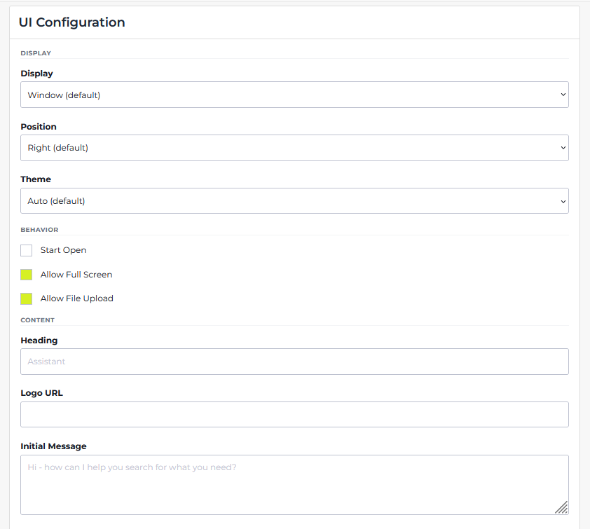
Display
Display controls how the search assistant appears within the browser. The default for this value is window.
display: 'window',
| Parameter | Effect |
|---|---|
| 'window' | Creates the HawkSearch shopping assistant as a pop-out window on the bottom corner of the screen. |
| 'drawer' | Adds a sidebar for the HawkSearch shopping assistant. |
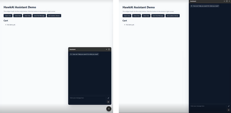
An assistant with display 'window' vs. An assistant with display 'drawer'.
Position
While display controls how the search assistant appears, position controls where it appears. Depending on the position, the HawkSearch shopping assistant can appear on either the left or the right side of the browser. If not specified, the search assistant defaults to right.
position: 'right',
| Parameter | Effect |
|---|---|
| 'right' | Moves the HawkSearch shopping assistant to the right side of the screen. |
| 'left' | Moves the HawkSearch shopping assistant to the left side of the screen. |
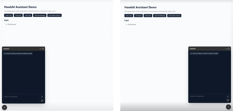
An assistant with position 'left' vs. An assistant with position 'right'.
Theme
The theme of your HawkSearch shopping assistant controls the color of the background, text bubbles, and more. This can help the shopping assistant be visually distinct from the background website, improving readability. The default for this setting is automatic.
theme: 'automatic'
| Parameter | Effect |
|---|---|
| 'light' | Sets the theme of the Shopping Assistant to always be light mode. |
| 'dark' | Sets the theme of the Shopping Assistant to always be dark mode |
| 'automatic' | Changes the theme of the Shopping Assistant depending on the theme set by the system. |
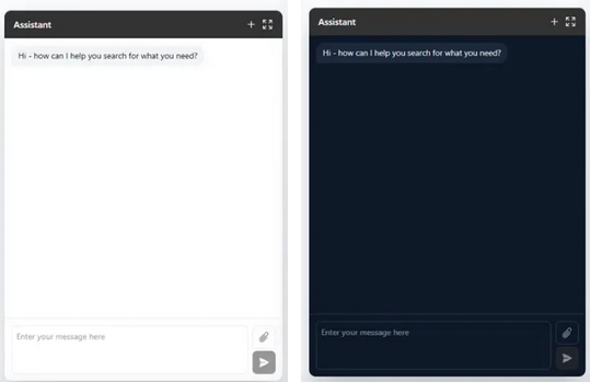
An example of a shopping assistant with the light theme (left), and a shopping assistant with the dark theme (right).
Behavior
Start Open
This parameter toggles whether the shopping assistant is open upon loading into the page. This value is false by default.
open: false
Allow Full Screen
This parameter toggles whether the user is able to expand the shopping assistant into full screen. This value is true by default.
allowFullScreen: true
Allow File Upload
This parameter toggles whether the user is able to upload files to the shopping assistant. This value is true by default.
allowFileUpload: true
Heading
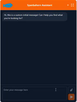
The heading refers to the bold text that appears within the search assistant's menu bar. This is commonly used to input the name of your search assistant. The default value is Assistant.
heading: 'Spanbahorn Assistant'

A shopping assistant with the default heading vs. A shopping assistant with a custom heading.
Logo URL
Initial Message
HawkSearch's shopping assistant will prompt the user with an initial question to guide the user into asking for assistance if needed. However, the initial message the shopping assistant sends can be configured to fit the tone, style, and common questions of your website. This initial message is not processed within HawkSearch's API.
initialMessage: "Hi, this is a custom initial message!'

A shopping assistant with the default initial message vs. A shopping assistant with a custom initial message.
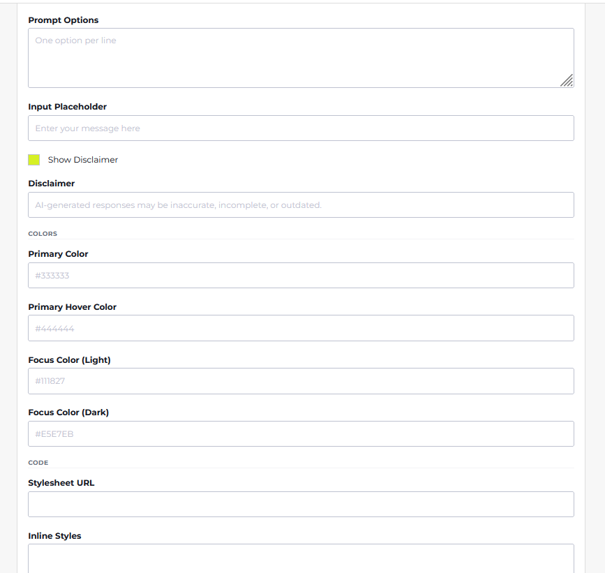
Prompt Options
Prompt options are a useful way to further guide users into prompting the shopping assistant for high-value, relevant questions. Not only does it save time for users attempting to ask frequently-asked questions, but it also informs the user about the capabilities of the shopping assistant.
Prompt options should be inputted with each different option on a separate line.

promptOptions: [
'Do you have any shoes?',
'What are your best ski goggles?',
'Can you recommend a product for me?',
],
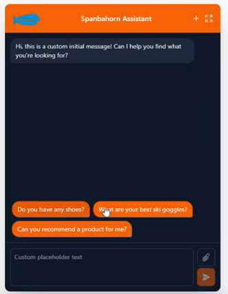
An example of a shopping assistant with prompt options enabled.
Input Placeholder
Placeholder text appears within the text box when the user hasn't typed anything in yet. If this value is omitted, the default placeholder text is Enter your message here.
placeholder: 'Custom placeholder text'
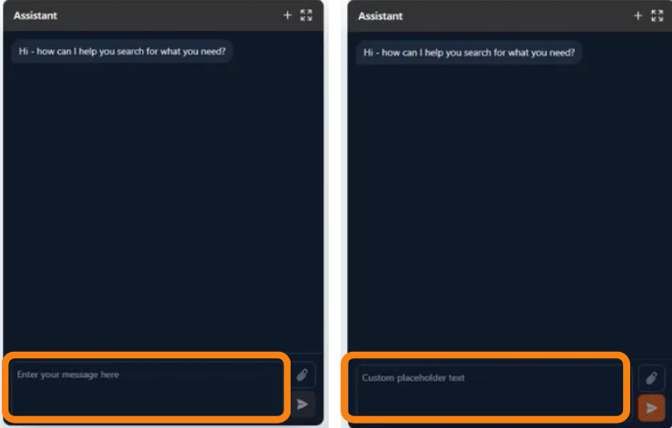
A shopping assistant with the default placeholder text vs. A shopping assistant with custom placeholder text.
Disclaimer
Disclaimers are used to give information regarding accuracy limitations of AI-generated responses, legal notices, and more. This helps to inform users about the limitations and potential issues that may come with AI-generated responses. Disclaimers can be enabled or disabled via the Show Disclaimer checkbox.
Colors
Colors are a fun and important part of personalizing your HawkSearch shopping assistant. This can not only improve readability of your shopping assistant, but it can also enable your shopping assistant to cohesively mesh with the rest of your website.
Primary Color controls the color of the send button, header, prompt options, and more. Primary Hover Color controls the color of primary elements when the mouse hovers over them. Focus Color (Light) Focus Color (Dark)
colors: {
  primary: {
    default: "#ea580c",
		hover: "c2410c",
  },
},
| Parameter | Effect |
|---|---|
| default | The color of the header, send button, user messages, and more. |
| hover | The color of a button while the cursor is hovering over it. |
A shopping assistant with custom colors.
Stylesheet URL
An optional field for applying custom styling to the assistant UI though an external CSS file.
Inline Styles
Allows you to define custom CSS directly within the configuration field. Good for quick styling overrides, or
minor UI adjustments without needing a separate stylesheet.
Once you're done configuring your assistant to your liking, press the orange Update button. This will save all of your changes.
Technical Documentation
For detailed technical documentation for overriding the Assistant, you can go here: https://www.npmjs.com/package/@bridgeline-digital/hawkai-assistant
Updated 2 months ago