

Creating widgets with Vue SDK
Overview
Using the Vue SDK package provided by Hawksearch, a variety of widgets can be created, each with its own specific purpose. These widgets will enable access to the search service and ready to use components to be placed on the web page. Depending on the purpose of usage the configuration and the layout is different.
Steps to create a widget
- Create a .js file that will contain the configuration code. It should be included in the build process. Open to edit.
- Include the main package class and styles
import HawksearchVue from '@hawksearch/vue';
import '@hawksearch/vue/dist/vue-hawksearch.css';
- Select the root element on which the widget will be rendered to. This could be achieved in several ways: by id, class selectors or specific data attribute. It is necessary to do this after the page is fully loaded
window.addEventListener('load', () => {
    var el = document.getElementById('vue-app');

    // Initialization code
    ...
});
- Create a configuration file for the widget. Again, the properties differ on different use cases, but these are the base one that are always set
const config = {
    clientGuid: '9c2a78v6bc9977w0929w88rf576y4476',
    apiUrl: 'https://searchapi.hawksearch.net/api/v2/search/',
    dashboardUrl: 'https://dev.hawksearch.net/',
    indexName: ''
}
These are only for demonstration purposes. Please contact an administrator from Hawksearch for the configuration data.
- Create the widget with this configuration
HawksearchVue.createWidget(el, { config });
- Save, build and view the page
Mobile support features are dependant on the configuration of the page the widget is placed on. Make sure that the following tag is available in the of the page:
Searchbox with Vue SDK
Overview
The most basic type of widget to be created is the search box. It presents the user with a search field in which a search term can be input and then the results can be displayed either somewhere on the same page or the user can be redirected to the results page.
Steps to create
- Create the basic widget configuration described in Creating widgets with Vue SDK
- Open the template file for editing. This could be a HTML page, or other type of markup generating framework (i.e. CMS). Make sure that the widget initialization file is included.
- Place the root element on top of which the component should be rendered. This element is accessed in the widget initialization file. For example, an empty with id
<div id="vue-searchbox"></div>
- In this root element the component structure of widget should be placed. Any additional elements are also allowed. The required component in this case is the
<div id="vue-searchbox">
    <div class="searchbox-outer">
        <h2>Search word</h2>
        <div class="searchbox-inner">
            <search-box></search-box>
        </div>
    </div>
</div>
- With this configuration the search results will try to populate the results widget available on the same page. If there are none available, no visual change will occur. The component can also redirect to other page where a results widget is available. In this case the page url should be supplied
...
<search-box search-page="/search-results-page"></search-box>
...
- Save all the files, re-build and review the page.
Results widget with search tools with Vue SDK
Overview
The results widget is the second part of the search process - the display of the search data. It could be placed simultaneously with the search box widget, or used separately on target page from the search.
Steps to create
- Create the basic widget configuration described in Creating widgets with Vue SDK
- Open the template file for editing. This could be a HTML page, or other type of markup generating framework (i.e. CMS). Make sure that the widget initialization file is included.
- Place the root element on top of which the component should be rendered. This element is accessed in the widget initialization file. For example, an empty with id
<div id="vue-results"></div>
- In this root element the component structure of widget should be placed. Any additional elements are also allowed. This should include primarily the component. Usually it is combined with .
<div id="vue-results">
    <div class="results-outer">
        <div class="search-facets">
            <facet-list></facet-list>
        </div>

        <div class="search-results">
            <results></results>
        </div>
    </div>
</div>
With similar process a separate widget for facets can be created and placed on the same page.
- Save all the files, re-build and review the page.
Single Page Application with Vue SDK
Overview
The search functionality of the search box and results can be combined in a single widget. This Single Page Application can then be used as an encapsulated entity with all processes and features combined. This approach is useful when the search features need to generally be used as self sufficient widget and have minor dependency with the wrapper environment.
Steps to create
- Create the basic widget configuration described in Creating widgets with Vue SDK
- Open the template file for editing. This could be a HTML page, or other type of markup generating framework (i.e. CMS). Make sure that the widget initialization file is included.
- Place the root element on top of which the component should be rendered. This element is accessed in the widget initialization file. For example, an empty with id
<div id="vue-spa"></div>
- In this root element the component structure of widget should be placed. Any additional elements are also allowed. The inner structure of this widget should basically be combination between the search field and the results widget.
<div id="vue-spa">
    <div class="search-box">
        <search-box></search-box>
    </div>

    <div class="search-facets">
        <facet-list></facet-list>
    </div>

    <div class="search-results">
        <results></results>
    </div>
</div>
With this setup all search queries will pass to the results component in the same widget. Facet data updates will also be handled in the same context.
- Save all the files, re-build and review the page.
Recommendations with Vue SDK
Overview
The recommendations widget purpose is to display of the recommendations data. It could be placed simultaneously with the search box and results widgets, or used separately on target page from the search and results.
Steps to create
- Create the basic widget configuration described in Creating widgets with Vue SDK and extend the config object with widgetGuid and recommendationApi
- RecommendationApi Url is visible on Recommendation API
WidgetGuid is visible on Workbench/ recommendations and can be provided through template and overwrite properties of the config object.
<recommendations widget-guid="..."></recommendations>
One template can contain one or multiple independent recommendations which target different widgets.
- Example of single recommendations usage.
<div class="hawk">
  <recommendations></recommendations>
</div>
- Example of consolidated usage of results and recommendations.
<div class="hawk">
  <div class="hawk__header">
    <search-box></search-box>
  </div>

  <div class="hawk__body">
    <facet-list></facet-list>

    <div>
      <results></results>

      <recommendations></recommendations>
    </div>
  </div>
</div>
- The following example contains searchbox, results and two recommendations.
<div class="hawk">
  <div class="hawk__header">
    <search-box></search-box>
  </div>

  <recommendations></recommendations>

  <div class="hawk__body">
    <facet-list></facet-list>

    <div>
      <results></results>

      <recommendations></recommendations>
    </div>
  </div>
</div>
Save all the files, re-build and review the page.
Custom Select Component
Overview
Custom Select Component resolves “drop-down is misplaced“ issue in IE.
For example standard select in IE looks like this:
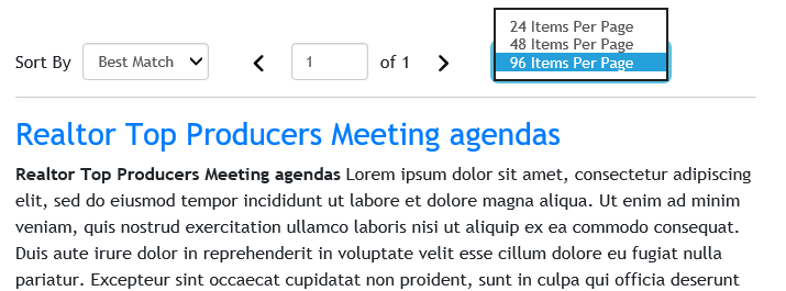
And custom select:

Steps to create
- Once results are shown properly CustomSelect component can be applied to the Sorting and ItemsPerPage components. For the reason they need to be overwritten with the following templates.
- Overwriting the Sorting Component
<script id="vue-hawksearch-sorting" type="x-template">
    <div v-if="showItems" class="hawk-sorting">
        <span class="hawk-sorting__label">{{ $t('Sort By') }}</span>

        <div class="custom-select-wrapper">
            <custom-select class="select"
                :options="sortingItems.map(function(item) { return {label: item.Label, value: item.Value} })"
                :default="sortingItems.filter(function (item) { return !!item.Selected }).concat(sortingItems.filter(function (item) { return !!item.isDefault }))[0].Label"
                v-on:change="onChange" />
        </div>
    </div>
</script>
- Overwriting the ItemsPerPage Component
<script id="vue-hawksearch-items-per-page" type="x-template">
    <div v-if="showItems" class="hawk-items-per-page">
        <div class="custom-select-wrapper">
            <custom-select class="select"
                :options="paginationItems.map(function(item) { return {label: item.Label, value: item.PageSize.toString()} })"
                :default="paginationItems.filter(function (item) {return !!item.Selected }).concat(paginationItems.filter(function (item) { return !!item.Default}))[0].Label"
                v-on:change="onChange" />
        </div>
    </div>
</script>
- Both components Sorting and ItemsPerPage are part of Results Widget. By overwriting them we are changing how the toolbar looks like. That is not changing any of the widget functionality and doesn’t require additional changes in root component or template.